TFaPT: October Recap (Visual Novel Devlog)

Progress Recap 2: A summary and discussion of progress made in October!
Progress Timeline
Full Timeline
2/10
Made a sketch of AV
Created a work schedule
Shared my 3rd weekly progress on Bluesky
3/10
Wrote Scene 22 and finished Story 1
5614 words
26 scenes
3 paths
1 ending
Started making concept art of AV’s disguises
4/10
Started making GUI concepts
5/10
Proofread the outline and edited grammar
New word count: 5595 words
8/10
Made logo concepts
9/10
Made more logo concepts
10/10
Finalized one logo design
Shared my 4th weekly progress on Bluesky
Edited Story 1
New word count: 5618 words
11/10
Scripted Scenes 1 and 2 in Inky
12/10
Rewrote the current script in Twine
13/10
Scripted Scene 3
16/10
Started scripting Scene 4
17/10
Recorded a playthrough that will be edited into a YT video
Shared my 5th weekly progress on Bluesky
18/10
Made a game banner
Made a dedicated Twitter account
19/10
Made progress with Scene 4
20/10
Finished scripting Scene 4
22/10
Made a spreadsheet to track in-game assets
Recorded assets for the first two scenes
23/10
Noted the assets for Scene 3
24/10
Noted the assets for Scene 4
Shared my 6th weekly progress on Bluesky
26/10
Started Scene 5
Started noting assets for Scene 5
27/10
Continued Scene 5 and noted its assets
28/10
Finished Scene 5 and noted its assets
Extended Scene 5’s outline
29/10
Wrote the October recap
A Finalized Outline
After two months of writing, I finally completed the outline for Story 1, I Don’t Want to Be Bored Forever: 5614 words, 26 scenes, 3 paths, and 1 ending! Gosh, I’m so proud of how it came out ^w^
But I didn’t want to stop at just finishing it; I wanted feedback. I wanted to know how others felt about the character, pacing and events, so I shared my outline in two Discord servers. Aside from expanding certain scenes, the responses boiled down to: “The story is well-paced, the branching paths are good, and AV’s worldview is very interesting, but its motivation to do certain things isn’t solid, and the focus on physical intimacy should be clarified earlier on.”
On unclear motivations, the reviewers noted that AV had no real reason to keep stalking the main human couple, such as asking other humans for directions and hitching rides, beyond mere curiosity. To solve this, I tied AV’s curiosity about the couple to its core drive: to feel pleasure.
Spoiler ahead! Click if you dare!
AV's first exposure to the couple is them doing the deed. Not knowing what they were doing yet noticing their pleasure, AV was compelled to know what they did, why and how to find similar gratification.
This makes the game’s focus more obvious early on. I also made smaller changes, like expanding scenes and changing AV’s reaction to certain moments.
You can read the entire thing below! Spoilers ahead! Beware!

Scripting, Scripting, Scripting
I’ve been so excited to dive into the script ever since I finished the outline, so I dedicated all of October to it! I initially wrote with Inky, but quickly switched to Twine. Twine has been an incredible scripting tool because it has better visualization for branching and looping paths, and its macros allow more unusual paths to be coded. Case in point:

A big boi, ain’t it? XD
Current Stats
Scenes scripted: 5
Word Count: 1520 (over twice that of the scenes’ outline count of 701!)
Twine Passages: 33
Much Needed Spreadsheet Action
One fateful day, as I was writing away in Twine, it became harder to track where planned assets would be used and how. That’s when a realisation suddenly hit me: I needed to organize them! So I did. The result? A big ol’ spreadsheet :D It records sprites, backgrounds, CGs, music and SFX, screens, completion status, and start and end dates. I’m really happy with my big ol’ spreadsheet :3

I may also make one to track choices and their corresponding stories later on ;)
Conceiving Logos and More!
Branding material for your game is important to create early on because it helps with marketing and communicating a specific vibe to viewers before your game is even ready. What’s also vital is studying branding for games similar to yours to note colour choices, arrangement of elements, font style, etc.
I went to Itch.io and looked at the cover art for greyscale games featuring monsters/non-humans, as well as how their pages looked. These were my observations:
From observing the cover art of greyscale Itch.io games, they have a minimal but moody vibe, with the logo or game title either prominently featured in the centre or in the bottom corner. The background is black, white, or grey and features the main character or a relevant symbol. Depending on the vibe of the game, the logo is usually ornate, roughly drawn, or simple and stiff.
From them, I landed on this design idea:
TFaPT's logo's text will mostly be grey, glitched and fuzzy, reflecting AV’s boredom. However, “Pleasing Thing” will be coloured bright neon pink. Vibe: fuzzy, glitched, monochrome with flashes of neon, intangible (wispy and/or translucent)
Next up was drawing concept art! I don't normally do concept art, but it was so worth it ^^ Watching the various designs evolve into their final form was such a treat.
I used a monochrome look with neon to reflect AV's worldview. "Pleasing Thing" is neon pink because that's the most important thing to AV. The saturated outlines add to the glitched/fuzzy look, and the tendrils look nice XD
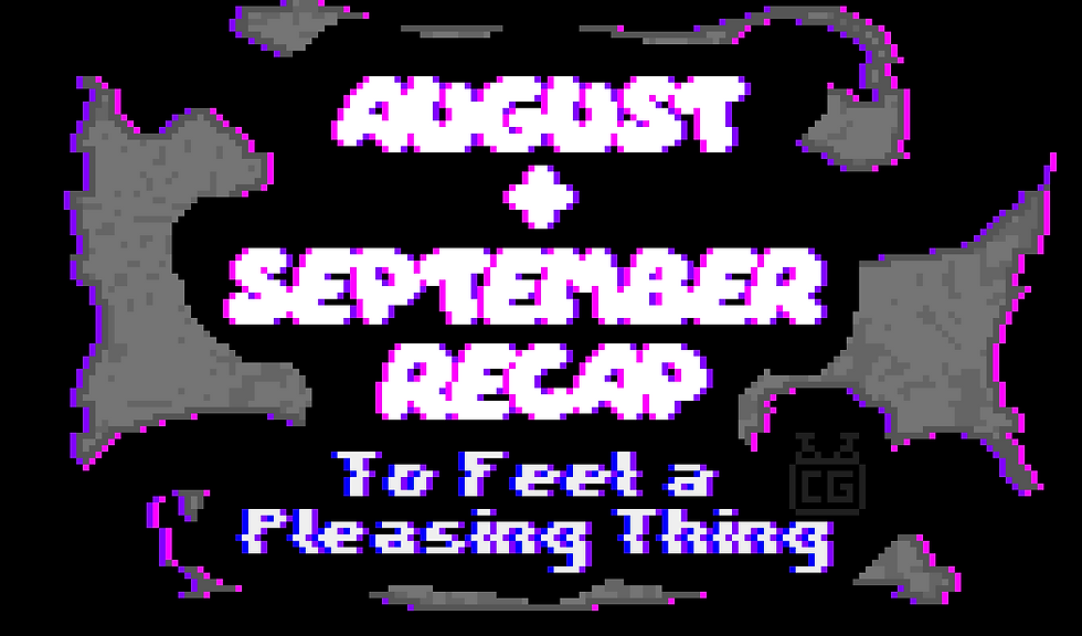
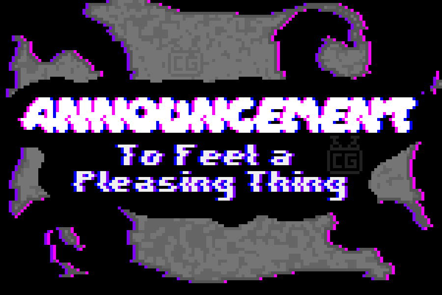
The same philosophy was also applied to the banner.

Achievement TL;DR
Completed and improved the outline
Started writing the script in Twine
Made logos and a banner
Created a dedicated Twitter account for marketing
Created an asset tracker spreadsheet
What’s Next?
I have a lot to do from November onwards:
Finish the script for Story 1
Actually program the game
Release Story 1 as a demo (maybe; depends on how many short stories I want to include)
Make videos talking about the game
That's all, folks! Leave a comment to tell me what you think! What do you think of the outline? Which scene is your favourite? Thoughts on the branding? Let me know!
You can also read the same post on Itch.io. Have a good one <3
Comments